In this tutorial you will learn how to simplify the skins you have created in the previous chapters. You will learn how to use the DEFINE and INCLUDE statements of the skinning language.
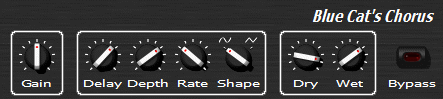
Let's start this simplification with the knobs example:
If you look at the code, you notice that the skin starts with (just after the <SKIN> statement):
<!-- Includes -->
<INCLUDE file="knob_black.inc"/>
<INCLUDE file="tooltip.inc"/>
<INCLUDE file="box.inc"/>
<INCLUDE file="on_off_button.inc"/>
This means that we include in this skin the files listed here. Just as if they were copied and pasted into this file (except the first line which is the <?xml version="1.0"encoding="utf-8"?> statement: the included files have to be valid XML files). Note that the extension of these files is not 'xml' but 'inc'. This is not mandatory (these files may have any extension provided that the content is valid XML), but we advise you not to use the xml extension, otherwise the user may confuse these files with a skin and would try to open them as if they were skins.
Let's now have a look at the content of one of these files ("knob_black.inc"):
<?xml version="1.0" encoding="utf-8" ?>
<DEFINE>
   <CUS_KNOB_BLACK base_type="IMAGE_PARAM_KNOB" pixel_range="51" image="knob_black.bmp" image_focus="knob_black_hi.bmp"
      image_hover="knob_black_hi.bmp" image_pushed="knob_black_hi.bmp" image_orientation="horizontal"
      cursor="system::hand" images_count="127" positions_count="101" />
</DEFINE>
This file uses the <DEFINE> statement that enables you to define your own elements. Here we have defined a new element called CUS_KNOB_BLACK, which is in fact an IMAGE_PARAM_KNOB widget (this is what the base_type="IMAGE_PARAM_KNOB" says), with a bunch of default values for its attributes defined here. To sum up, this statement says that we will use later in the skin the CUS_KNOB_BLACK which is nothing more than an IMAGE_PARAM_KNOB with pixel_range="51" image="knob_black.bmp" image_focus="knob_black_hi.bmp" image_hover="knob_black_hi.bmp" image_pushed="knob_black_hi.bmp" image_orientation="horizontal" cursor="system::hand" images_count="127" positions_count="101" as default attribute values.
This means that each time we use the CUS_KNOB_BLACK element, we do not need to repeat these attributes. If we do so, the values we set will override these default ones.The other files contain the same type of statements, to define the CUS_TOOLTIP, CUS_BOX, and CUS_ON_OFF_BUTTON elements. Note that all these element names start with 'CUS_', which stands for 'custom'. This is to ensure upward compatibility, to make sure we won't use for these elements names that will be given to new elements of the language in next versions. The names starting with CUS_ are all reserved for you designers. Now look at the usage of these new tags in the skin:
<!-- Param 1: a column containing a knob and the name of the param-->
<CUS_BOX>
   <COLUMN v_align="top">
      <CUS_KNOB_BLACK param_id="dsp.input1" positions_count="41" pixel_range="41">
         <CUS_TOOLTIP param_id="dsp.input1" value_format="+.0" />
      </CUS_KNOB_BLACK>
      <PARAM_TEXT param_id="dsp.input1" content="{name}" />
   </COLUMN>
</CUS_BOX>
The <CUS_BOX> element is used as is. No attribute is added or modified. The <CUS_KNOB_BLACK> element here adds the param_id attribute to identify the right parameter, and modifies the default value we have defined for positions_count and pixel_range, because it has 41 possible integer values (-20 dB to + 20 dB) and we want it to be increment dB per dB. All other attributes are directly inherited from the definition we have made previously. The <CUS_TOOLTIP/> element used here uses two more attributes, the param_id and value_format, and all other ones take the default values of our definition.
This simplifies the skin design a lot since you can reuse your components, and if you want to modify the look of your knobs for example, you just have to change one definition in one file, instead of modifying it as many times as you have used the same knob in your design.
Note that you can also use the <DEFINE> statement inside the skin (it does not need the <INCLUDE> element). For example:
<SKIN author="Blue Cat Audio" name="Sample 1 for Blue Cat's Chorus" language_version="1.0"
   font_face="Tahoma" font_height="11" text_color="#ffffff" font_quality="cleartype" layout_type="column"
   background_image="bg.bmp" repeat="true" v_margin="5" h_margin="10" spacing="3">
   <!-- Definitions -->
   <DEFINE>
      <CUS_ON_OFF_BUTTON base_type="IMAGE_PARAM_BUTTON" image="on_off_button.bmp" image_orientation="horizontal"
         cursor="system::hand" images_count="2" />
      <CUS_BOX base_type="IMAGE_GROUP_BOX" image="box.bmp" h_margin="8" v_margin="8" layout_type="row"
         spacing="4" />
      <CUS_KNOB_BLACK base_type="IMAGE_PARAM_KNOB" pixel_range="51" image="knob_black.bmp" image_focus="knob_black_hi.bmp"
         image_hover="knob_black_hi.bmp" image_pushed="knob_black_hi.bmp" image_orientation="horizontal"
         cursor="system::hand" images_count="127" positions_count="101" />
      <CUS_TOOLTIP base_type="PARAM_TOOLTIP" show_on_click="true" delay_ms="0" />
   </DEFINE>
(...)
But it's more interesting to put these definitions in separate files, because you can reuse them for other skins, as we will show in next samples.
This sample is another version of the sliders skin from previous chapter:
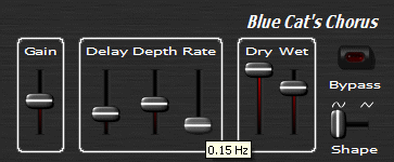
Thanks to the definition files created in previous skin, the design is very fast. We just need to define a custom object for the sliders and we are done:
<!-- Includes -->
<INCLUDE file="slider.inc"/>
<INCLUDE file="tooltip.inc"/>
<INCLUDE file="box.inc"/>
<INCLUDE file="on_off_button.inc"/>
and in slider.inc we define the custom slider:
<DEFINE>
   <CUS_SLIDER base_type="IMAGE_PARAM_SLIDER" param_id="dsp.input5" image="slider_small.bmp" thumb_image="slider_thumb.bmp"
      thumb_image_focus="slider_thumb_hi.bmp" thumb_image_hover="slider_thumb_hi.bmp" cursor="system::hand"
      positions_count="101" />
</DEFINE>
That's it!
It's exactly the same process here. Just look at the 'sample 3.xml' file and the 'fader.inc' file.
Note the following lines:
<!-- Defines -->
<DEFINE>
   <CUS_BOX2 base_type="CUS_BOX" spacing="8" />
</DEFINE>
We have defined here a custom element that is based on an custom element. This means that the new CUS_BOX2 custom element inherits the default values of CUS_BOX and defines new default values (here it overrides the spacing attribute to make it larger).
As you can see the INCLUDE / DEFINE elements are very powerful. Be careful not to build too complex systems with them. You might otherwise get lost in your includes and create cycles (include files that already include this same file...). It's the same for definitions: do not create cycles in your definitions!
For more information about all these elements you have used and a detailed description of each attribute, look at the Language Reference section.